When I attended the Gartner Data & Analytics Summit in Frankfurt, October 2018, I learned that a new role is hot: that of the citizen data scientist. This person, or role, is situated somewhere between the hardcore data scientist who speaks in formulae and neural network slang on the one hand, and on the other hand people who need to make substantiated business decisions but prefer to limit the use of numbers due to unresolved trauma from a statistics lesson a long time ago.
The concept was well received by the public: mainly CEOs and other high ranking business people who all want their company to become more data-driven but struggle to find the right people inside or outside their company. Once everyone was convinced of the importance of raising citizen data scientists in their company it was time to hear how to achieve that.
The answer – as you might expect from this kind of summit – came in the form of software. Although not new to the market, the so called self-service BI products like Qlik, Tableau, and Power BI were obviously happy to hear they could be the facilitator of this citizen data scientist revolution. The attendees were just as delighted: instead of pressuring their HR department to find a data scientist they would just have to buy that piece of software and everyone would magically turn into a citizen data scientist with just the Qlik of a button!
I don’t agree. Don’t get me wrong, I do agree that the products mentioned are marvelous and could make statistics, data science, and related disciplines much more accessible to a wider audience. I just refute the idea that software by itself is the solution, just like how the invention of paper wasn’t enough to reach near world-wide literacy. If we want more citizen data scientists we should focus on the people, not the software. A lot of what we call data science today finds its origins in good old fashioned statistics but with a strong influence from computer sciences on top, so pretending we can a citizen data scientist without covering some statistics would be naive. A decent understanding of the meaning of a parameter, test, or whatever it is you want your software to calculate is crucial for not making the mistake of choosing the wrong tool for the job and for being able to explain what you did afterwards. In the next paragraphs I’ll illustrate my point with a few requirements for a citizen data scientist that to this day are not available in any software.

Asking the right questions
Let’s imagine you work for a decently large web shop. If customer satisfaction is not met, you quickly drown in this highly competitive market. Recently you did some research using customer feedback data and discovered that customer reported satisfaction regarding delays on delivery was a very strong predictor of overall satisfaction and customer locality. You present this to management, and they ask you to track delivery delay very thoroughly, report on it split by numerous dimensions (geographically, customer related variables, etc.), build a predictive model so the company can adjust estimated delivery times, and create an interactive application that visualises deliveries, delays, and related variables. Luckily a lot of those things are not as difficult as it sounds given the help of the right tools.

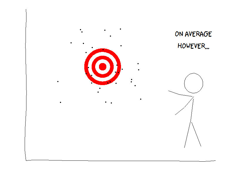
Figure 1: Not so different from average delays. All figures by the author; XKCD styling by R-package xkcd
Before you start, you ask them one question: What is a delay? A few of the managers smirk as they think you intended to be funny, others express embarrassment regarding your apparent complete ignorance, and your supervisor starts mailing HR to find a replacement for you. Fortunately at least someone agrees it’s worth discussing the operationalisation of the word delay. When is a package considered late? A minute after expected delivery? An hour? A day? Should we calculate the average difference between the moment a package is expected to arrive and the moment of actual delivery? Maybe, but does that mean if one package is a day early and the next one is a day late were on time? If the package got lost and we reimbursed the client, does this still count as a delay and if so, for how much. If only part of an order arrives late, do we count the whole order as delayed or only the late items? Maybe the answer to that last question depends on the composition of the order: if the client ordered computer components and only the CPU is on backorder the customers experience might be the same as if the whole package was late (as he or she can’t build their computer anyway).
As you can imagine, a simple question to operationalise a key concept within the company can result in a multitude of opinions, but you can’t start your data science project without an aligned vision because otherwise the results will be rejected by management anyway. In my experience this is a very difficult aspect of data science, and to the best of my knowledge no software is capable of doing this for you. You might consider this more the task of a business analyst, but a (citizen) data scientist should also have this capability to a certain degree.
Choosing the right parameters
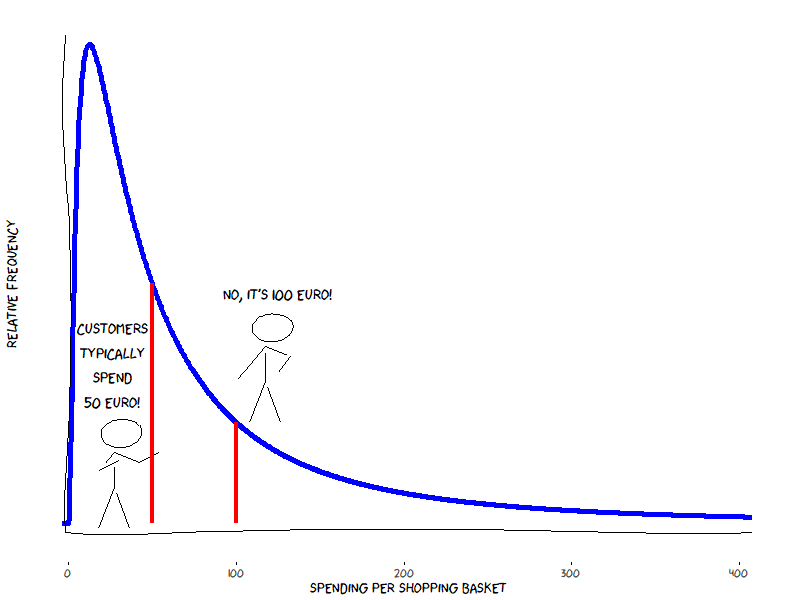
You’re also responsible for the reporting regarding the sales of the previously mentioned web shop, and you ask two employees to tell you how much a customer is typically spending when they buy from your site. One of these employees will tell you it’s fifty euro while the other one insists it’s one hundred. You’re used to some irregularities in preciseness of those reporting to you, but this is outrageous. On closer inspection however it turns out both might be right; what we’re dealing with is a very typical case of median versus mean.
Naturally you remember very well the median and the mean being different parameters of central tendency whereby the median corresponds with the middlemost observation if you would sort them from low to high, while the mean is the sum of all values divided by the number of observations. But do you – promise to be honest to yourself before answering – remember when to use which one and why? What about the relationship between median and mean with regards to the symmetry of the distribution of the data? Did you think the mean could be double of the median?

Figure 2: Median versus mean The above example about the web shop is fictitious but not unrealistic. These kinds of businesses tend to have a very skewed distribution when it comes to sales (it’s a log-normal distribution if you really want to impress somebody at a party): most market baskets contain one or more affordable products (e.g. some books or movies, or whatever you tend to buy online on a more or less regular basis), but once in a while there is someone who decides that the very latest innovation in televisions, costing 50.000, could really add some flair to their living room. This rare sale explains the right tail on the distribution and will lift the value of the average sale, but doesn’t really affect the median.
So, which one – median or mean, maybe even another parameter – should we use in our reporting? That depends on who’s asking, and what exactly they need to know. The chief marketing in your company might be more interested in the value of the market basket of everyday customers, so they would probably be more interested in the median value. The CFO on the other hand is possibly better suited with information about the mean value as this is just the ratio between two other key figures – total sales value and number of sales – they already expect in their reporting.
My main goal of the above paragraph was not to educate you about parameters of central tendency (you can, however, consider it a nice bonus). The goal was to make you question if it’s sufficient to have a software product that can provide you with different statistical parameters, or if it is also desirable that the person who provides you the output can explain to you the rationale behind their choice. Be critical towards software that promises you don’t have to know this as it magically makes the right decision for you.
Using the right visualizations
A vast amount of working time of a data scientist (citizen or otherwise) is spent on creating visualizations of data and results. The goal of this visualizations is not just to be pleasant to the eyes, but mainly to aggregate a vast amount of data into something a human can quickly comprehend. In general, we as humans are surprisingly good in drawing conclusions from a graphical representation compared to a long table of raw data. This also has a disadvantage: we tend to make quick assumptions and conclusions when presented with a graph, even if we don’t actually understand it very well, or even if it is just plain wrong.

Figure 3: How not to visualize your data The choice for the right graph for the job should be driven both by properties of the data – scales of measurement and such – and what it should actually highlight. This may sound pretty obvious, but in practice the choice for a certain kind of graph often originates from the business side, frequently influenced by something they’ve seen in a magazine or on the web. So, next time somebody asks you for a word cloud, something with a lot of 3D, or just anything that doesn’t fit the data properly, take a deep breath and calmly explain why there might be better options.
Concluding remarks
The above paragraphs contain just a few examples of why software by itself isn’t enough to turn your employees into citizen data scientists overnight. I deliberately selected cases that are relevant to every citizen data scientist, even a starting one, as they are even applicable to someone with just a basic knowledge of descriptive statistics. There are of course many more relevant skills where the aspect of human knowledge should still not be discarded, like for example:
In-depth knowledge of how to handle different types of data, including insight into scales of measurement and probability distributions.
Choosing the right model for the job. It’s great if your complex neural network with dozens of hidden layers based on nearly every variable in the company is capable of good predictions of the target variable.But have you checked if something more basic can do the job, like a decision tree on a limited set of variables that can achieve similar results while being way less complicated to calculate and maintain and most of all way easier to explain to the business?
Selling the result: No matter how amazing the predictive value of the business model you just built and no matter how much the potential gain (profit, cost reduction, a certain KPI, . . . ), not the slightest benefit will be gained if your project is not put to use.

I hope that after reading this article you’re inspired to start looking for potential citizen data scientists in your company. If you do, chances are you’re now asking yourself how to get them properly trained. Luckily there are many training options available, both in traditional form, as well as self-paced online courses (definitely check out edX and Coursera). The most powerful way however would be to train them on the spot by letting them work together on real projects in your company with a more experienced data scientist that you either have already in house, or you can find one at a specialised consultancy firm like Keyrus.
Any questions? Don’t hesitate to contact me: joris.pieters@keyrus.com
