In part 1 of this series you read all about the difficulties to stay objective when selecting the data you want to work with. Simpson’s paradox, multicollinearity, Robinson’s paradox, survivorship bias, and cherry picking were all issues showing how important your decisions as a processor of data are. In this second part we’ll show that you yourself can become data which will seriously influence the outcome of your research, and we’ll also show how critical it is to choose the right measurement tool.
Are you part of your own data?
The inspection paradox
Imagine you’re driving on a highway; it’s busy but traffic is still moving smoothly. Here in Belgium the maximum speed allowed on the highway is 120km/h. I want to be at my destination as quick as possible but as a law abiding citizen I would not go over the speed limit, so let’s say I average around 110km/h. My initial assumption is that other people would behave more or less as I do, so we expect the speed of all cars on that highway to be normally distributed with an average of 110km/h. A policeman with a speed radar is standing next to the highway, and the graph on the left of the figure shows the distribution of the speed of the cars they observe. In my car however I experience something completely different! It seems like I’m the only responsible driver here, everybody else is driving either rather slowly or much faster than me. The distribution of the speed that I observe from my car looks like the one on the right:

Figure 1: Speed of cars (km/h) according to somebody witching from the side (left) or as perceived by somebody going 110 km/h (right)
What is happening here? Basically I’ve became part of my own data. Most cars you see are either passing you or being passed by you; in other words they are faster or slower. You will notice cars going the same speed as you but they will stay right in front or right behind you for a longer period of time. Other cars driving the same speed as you but further in front or behind you are just way less likely to pass you or be passed by you. Formally we call this a case of the inspection paradox which happens when the probability of observing something (e.g. a car going at a certain speed) is not independent of its magnitude (the speed of that car). Using yourself as a point of reference co-occurs with cognitive anchoring and should therefore always be avoided.
The friendship paradox
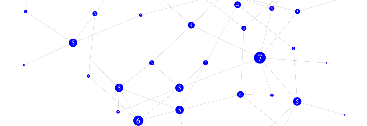
A related topic is known as the friendship paradox which states that your friends – on average – have more friends than you do. This sounds contradictory but does make sense if we represent friendships (or whatever relationship for that matter) as a graph. Every node (the dots) in the following drawing represents a person, and the number in the node corresponds with the number of connections to friends. Most nodes in this example connect to two or three others, but the ones they connect to are more likely to be the node with higher numbers. The “popular” node in this case, i.e. those with six or seven connections, are rather rare but account for more connections.

Figure 2: Graph representation of connections between people.
There are more people (potential friends of yours) with only a few rather than a lot of friends, so if you would pick a person at random it’s more likely that this person doesn’t have a lot of friends, rather than have many friends. The wrong assumption that results in the paradox is that the choice is not random. The reason it is less likely to have a friend with fewer friends is due to the fact that a person with few friends is simply less likely to be a friend of yours than someone with lots of friends.
Don’t think that it’s only your friendships that are victim of this paradox: your sexual partners have had – on average – more sexual partners than you, your co-authors have published more than you, and your street probably ends in a bigger street. Basically this counts for all types of networks, but especially when we’re discussing social networks the paradox is apparent as we tend to switch between different points of view on the data: that of the observer looking at the graph versus the one where you’re part of the graph and look towards your friends.
If you want to read more about the inspection paradox and the more specific friendship paradox, I recommend the article The Inspection Paradox is Everywhere by Prof. Allen Downey (2019).
IF YOU WORK WITH DATA
You as a researcher should never be part of your own data and if you adhere to this you’ll not come to wrong conclusions in your research. Ask yourself if the observations could have had a different probability distribution if they were taken by someone else. If so, your own position might be of influence which should be removed from the equation.
Your choice of measurement instrument can influence your conclusions
Measuring length is not that straightforward
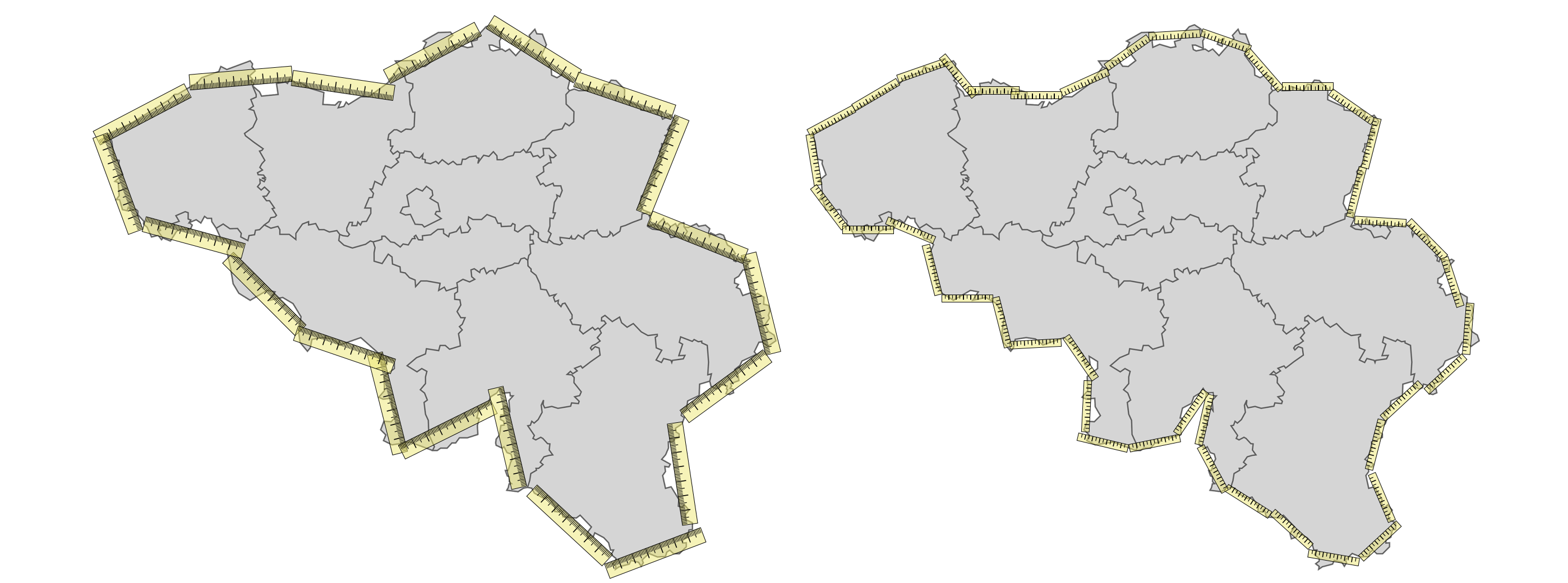
Today I wondered what the total perimeter of Belgium is. As the weather was nice I decided not to Google it but instead go outside with a ruler and put it on the country borders. In total I had to lay down my ruler exactly twenty times (it was a rather big one); this is represented on the left of the following picture. During measuring I noticed my ruler didn’t allow me to measure some parts as accurately as I was hoping to as I had to cut some corners and approach the non-straight parts. I went out again but this time with a ruler exactly half the size of the previous one. The result of the second attempt is visualized on the right. With the smaller ruler I counted forty-two units. Given the fact that the small ruler was half the size of the big one that is an increase in perimeter of 5%.

Figure 3: The total perimeter of Belgium measured twice with rulers of different lengths. Obviously both my rulers are way too large and inaccurate to measure the perimeter of a country. As you further decrease the size of your ruler (i.e. increase the size of your accuracy in measurement) the resulting perimeter will increase. You might think that at some point this would converge to the “actual” perimeter, but this is where we arrive at the paradox: the total perimeter measured will keep on increasing as you keep refining your measurement even though you can’t imagine the perimeter of a country to be infinity long.
What happens – especially at natural borders like coastlines, so that’s where the name coastline paradox comes from – is that the closer you look (which you do if you’re using a smaller ruler) the more detail starts to arise As you walk at the coast you measure around a boulder something you might not have done with a less accurate ruler. On closer inspection you see that the boulder does not have a smooth surface so you take a smaller ruler to take the dents into account thus increasing the total length of your coastline. Theoretically you can go on to a sub-microscopic level, to eventually come up with the answer that the coast has an infinite length.
If you work with geographical data this is a real issue, but there are more common types of data where this problem arises like when a continuous variable is represented in a discrete way. Common examples of this are signal data (waves) and graphical data (pictures). A digital picture most commonly represents objects using pixels which we call raster-based images. Vector-based images exist too but are generally limited to specific applications. Problems arise once we start measuring on those raster-based images. If you draw a circle using a raster-based imaging program like Paint or GIMP you actually get an approximation which is worse as the resolution is lower. Take for example the 12 by 12 pixel circle in the following picture:

Figure 4: A 12 by 12 pixel circle. The red line is the radius; in blue a quarter of the circumference is marked.
The red line is the radius (r) of the circle which is 6 pixels long. Let’s look what the circumference (C) would be. A quarter of the circumference is highlighted in blue. If we sum the length of the segments we get (from left to right): 4 + 1 + 2 + 1 + 1 + 2 + 1 = 12. As this is exactly one quarter of the circle the whole circumference is 12 · 4=48. We all know the relationship between the radius of a circle and its circumference:
C = 2 · r · π
If we put our radius of 6 and circumference of 48 in the equation we find that π = 4 which is obviously wrong. The reason is of course that what we were measuring was not the actual circumference but the way around the pixels. This applies not only to circles but any non-straight path. There are formulas to accurately measure non-straight lines on a discrete grid to correct for this problem.
Measurement in social sciences
Some years ago a student working on her Master’s thesis asked me to take a critical look at a questionnaire she had developed for use in her research. She wanted to measure the consumption of porn in today’s adolescents. One of the questions was “How often do you watch porn?” with different possible answers ranging from “Never” to “Multiple times per week”. I was impressed with the construction of the questionnaire and only had minor suggestions, one of which was to add an extra possible answer to said question being “Multiple times a day”. The reason was not that I expected people would actually use this answer but because when it comes to socially sensitive subjects people have the tendency not to choose the most “extreme” answer. Only the adjusted version of the questionnaire was used so we were not able to prove that adding the “Multiple times per day” option had a significant effect on how people would answer this question. However it’s worth mentioning that despite our expectations a rather significant number of the participants chose this option.
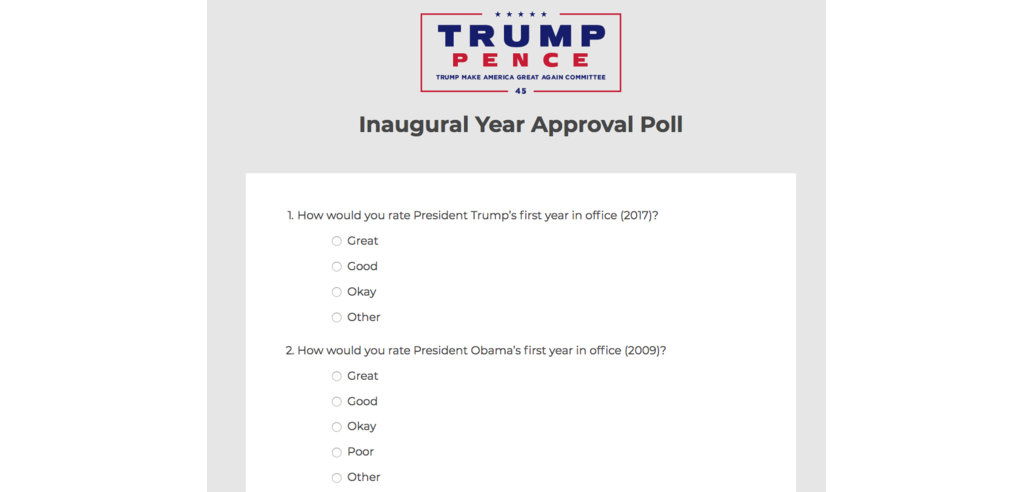
Most mistakes regarding the use of a too limited range in possible answers in questionnaires are not intentional but the result of poor questionnaire design. These problems are then visible during the data-analysis when lots of the items show an extremely skewed distribution which often makes it very hard for the statistician working with the data. There are however cases where this is intentional:

Figure 5: Something missing? (Watson, 2017) There is a whole field of research when it comes to designing questionnaires so that they measure as objectively as possible. Avoiding bias due to effects of socially desirable answering as well as making sure you capture the right range are just two of many known points of attention. If you even plan to work with this kind of data, especially if you need to work with non-standardised tests and want to develop questionnaires yourself you should study this thoroughly as bad design will lead to wrong conclusions. Even if you don’t do this kind of research yourself, when you read conclusions by others check out how they measured it.
IF YOU WORK WITH DATA
Accurate measuring is key regardless of what kind of data you work with as the quality of your data always determines the upper level of quality of a model you build on top of. We illustrated this with two totally different types of data: images and questionnaires. At first sight they seem completely unrelated but they do share a common pitfall.
Conclusion for this part
I hope that by now you’re already looking a lot more critically towards your own data-related work and see ways to improve it in the future by being aware of all those pitfalls. There’s still some more to come though which will be covered in the third and final part.
References
Downey, A. (2019). The Inspection Paradox Is Everywhere. https://towardsdatascience.com/the-inspection-paradox-is-everywhere-2ef1c2e9d709
Watson, K. (2017). Trump ’Approval Poll’ Offers No Negative Options. https://www.cbsnews.com/news/trump-approval-poll-offers-no-negative-options/
Any questions? Don’t hesitate to contact me: joris.pieters@keyrus.com Curious for more? This is a series: read "the human behind the data" part 1 and part 3!
