Aesthetics and design play a huge part in maximising the overall user experience and arguably should be prioritised alongside other factors such as data quality when planning an analytics project. After all, if a user enjoys the experience of using a particular platform or tool, they are far more likely to return to it again and again.
There are also many principles of web design in general, such as use of contrast and white space, that can be applied to dashboards to help guide the eyes of the user to the information they need. A discussion of this topic is beyond the scope of this blog, but here are three great ways to implement custom designs in your Qlik Sense dashboards that we have had great success with…
Custom Themes
Perhaps the most straightforward way to modify the default Qlik styling is by creating a custom theme. This is particularly great for incorporating your organisation’s branding into Qlik, as it allows you to specify default colours and fonts. Creating a custom theme requires some knowledge of CSS, but to get started we would recommend the following steps:
Creating Your Custom Theme
Locate the default Qlik Sense theme folders. This location can vary depending on your version of Qlik Sense
Make a copy of the theme folder (note: we strongly recommend you do not edit or change the default)
Explore the code and make some edits to the copy. Within the folder you’ll find 3 files:
.QEXT file – this is a Qlik Extension file. In this file you can change basic information about the theme, such as its name, description and author
.CSS file – this file contains some CSS that controls fonts and colours at a global level
.JSON file – the JSON file is where colours and fonts for specific items in a Qlik dashboard are controlled. For example, one thing you can do here is specify the default colours that are shown in the Qlik palette.
Zip your new theme folder and import it into the QMC as an extension
You should now be able to select your new theme from within any app
If you want to create a new theme without getting into the code, there are also free online tools out there that can generate the files above for you, such as this one at SenseTheme.com
Advanced Theme Customization
For more advanced customisation you can make use of your browser's source code viewer in order to make changes at a more granular level. First, use the code viewer to identify the HTML class and IDs of a specific item on the page that you’d like to change, then add the desired CSS into your theme’s CSS file. Whilst this can be time-consuming, it can also give you great flexibility. We are adopting this method currently to create a Dark Theme for one of our clients.

Extensions
Another way to customise the look of your dashboards is to use extensions that allow for a greater level of control than the default Qlik visualisations.
Enhancing Dashboards with Vizlib
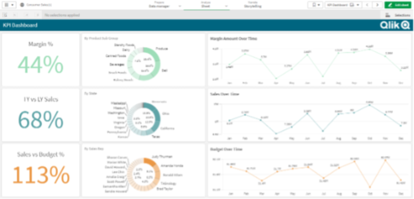
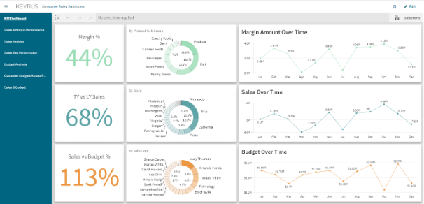
A great example of this is the library of Vizlib extensions. In addition to bar charts, tables and other visualisations, Vizlib offer the ‘Sheet Menu’ extension. This is a really powerful extension that allows you to redesign the structure of the page. Don't like the default title bar or selection bar that come with Qlik? You can remove them. Want to add a navigation menu on the left hand side of the sheet? You can do that too. Here's a before and after of a Qlik application that's had the sheet menu extension applied to do both of these things:


Combine Vizlib sheet menu with the other Vizlib charts and you’ll end up with a dashboard that doesn’t look like it’s been built with Qlik Sense at all.
The Dev Hub Ironically, many great Qlik developers out there won't have used, or even heard of, the Dev Hub. You can access it from the menu within the Qlik Hub, and it helps you to build a number of different tools and integrations.
Creating Custom Extensions
Firstly, you can build your own bespoke extensions from scratch. This will require some knowledge of JavaScript and can be quite time consuming, especially if third party extensions such as Vizlib can give you what you need. Nonetheless, the Dev Hub can help get you started to make charts that are completely customisable. You can also leverage third party visualisation libraries, such as d3, to make interactive charts powered by Qlik’s engine.
Building Mashups and Embedded Analytics
Secondly, you can embed Qlik content into any existing web platform. Qlik calls these integrations mashups, and has a lot of great demos on their website. It could be that want to embed a Qlik chart showing Financial Year Sales into an end of year statement from your company boss on your company’s internal news portal. Or, like one of our financial services clients, you may want to add Qlik objects into another widely used platform like Salesforce. The great thing about mashups (also referred to as embedded analytics) is that the content remains interactive and users can make selections just as they would in any Qlik app. Selections can even be passed from one page to another.
Measuring the Impact of Design Changes
Whilst the tools above can be all deployed to redesign your dashboards, it can be difficult to quantify the benefit of good design from a business perspective. Luckily, Qlik's monitoring apps provide plenty of user stats that can help. Let's say, for example, you've renovated an app to use Vizlib’s charts and you've added a sidebar for navigation because your other company systems have similar interfaces. Using the monitoring apps, you can observe changes in average session length, or visits to each of the app’s sheets that will provide evidence as to whether the new look has enhanced user experience. Also, don't forget to go looking for direct feedback from your users as well. The stats are great, but there’s no substitute for hearing and seeing first-hand what a user experiences.
