You are leaving our main website to go to our chinese website hosted in China. For legal reasons there will not be any links pointing back to the main website.

Go to chinese website
Logo - Keyrus
Logo - Keyrus
  • Playbook
  • Services
  • Insights
  • Partners
  • Careers
  • About us
    Company purpose
    Innovation & Technologies
    Committed Keyrus
    Regulatory compliance
    Investors
    Management team
    Brands
    Locations

Blog post

Leveraging Tableau stories in order to understand Inflation in the UK

Daniel Horton

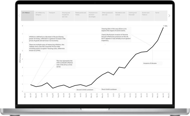
In Tableau, a story is a sequence of visualizations that work together to convey information. You can create stories to tell a data narrative, provide context, demonstrate how decisions relate to outcomes, or to simply make a compelling case.

In essence a story is a collection of sheets, arranged in a sequence. Each individual sheet acts as a point in the story, allowing users to interact with the story to reveal new findings or ask new questions of the data.

In this example, a story has been used to breakdown the complexity of price inflation by building up to the macro view in small steps. Providing a more intuitive "story" to the user allows them to engage with what it is you are trying to convey.

A link to the presentation can be found by clicking the link above.
whatsapptwitter
linkedinfacebookworkplace
newsletter.svg

Never miss an insight

Stay updated on the latest articles, events, and more

Your email address is only used to send you the Keyrus newsletter and for commercial prospecting purposes. You can use the link in our emails to opt-out at any time. Learn more about the management of your data and your rights.

Continue reading

Success story

Gain deeper customer insights with Qlik Sense on-demand app generation

March 29, 2022

Leveraging customer data to understand their behaviour, preferences and motivations can lead to significant return on marketing investments. However, with large numbers of customers, traditional business intelligence practice is to reduce customer data down to aggregated metrics, typically focussed on pre-defined segments (or cohorts) of the customer base. Whilst useful, this process discards some insight that can be revealed only by looking at individual customer-level records. In this blog, we discover a way to use Qlik Sense's On-Demand App Generation to study user-defined cohorts.

Blog post

The report factory is dead; long live the PDF report!

May 3, 2022

by Hannah Lissaman, Senior Consultant, and Louis Lindsay, SDA at Keyrus UK

Expert's opinion

Three ways to restyle your Qlik Sense dashboards

September 9, 2021

Creating and deploying enterprise dashboards has never been easier. With Qlik Sense, a business user of a dashboard can even create their own content, simply drag and drop a chart and select from prepared master items. This is one of many features that make Qlik Sense a great platform for organisations promoting data literacy and self-serve analytics. However, sometimes the resulting one-size-fits-all look and feel of Qlik Sense dashboards can leave us feeling a bit limited in terms of design.

Blog post

Using Alteryx to Perform Data Dictionary Checks

September 9, 2021

When creating reports for clients they can be financial penalties if they don’t meet the agreed standards, particular in the financial sector.

Logo - Keyrus
London

Warnford Court 29 Throgmorton Avenue London EC2N 2AT

Phone:+44 (0)20 3553 4900

LinkedInInstagram
PlaybookServicesInsightsPartnersCareersAbout us
Company purposeInnovation & TechnologiesCommitted KeyrusRegulatory complianceInvestorsManagement teamBrandsLocations
Legal notice & Terms of use
Privacy policy
Data protection