The Tableau Conference wrapped up on November 12th and, for the second year in a row, it was a fully virtual event. With 308 episodes and five concurrent channels of content, it’d be impossible to watch all of the sessions quickly. To help you navigate, we’ve compiled a list of the ten most essential sessions that provide excellent range and an overview of the entirety of the three-day event. There is no ranking to the list below and Tableau owns the rights to all the images (presentation captures).
1. Tableau Conference 2021 Opening Keynote (Tableau)
The keynote provides a high-level of Tableau’s year in review, focusing on diversity, inclusion, and new innovations. The key takeaway from this session is an overview of new accessibility features within Tableau (read on for a quick recap!).

By combining the Salesforce arsenal of Salesforce, Tableau, Slack, and Tableau CRM, users will be able to utilize more of the features from Salesforce in Tableau (namely, predictive analytics and data, and a hybrid of Tableau CRM’s data flows and Tableau Prep into Tableau), making a robust package available soon for Tableau users.
Finally, the Tableau Exchange helps customers build dashboards and utilize extensions, connectors, and datasets to build visualizations while applying best practices. As a partner in the Exchange Program, Keyrus US has a variety of resources and services available on this topic.
2. Devs on Stage (Tableau)
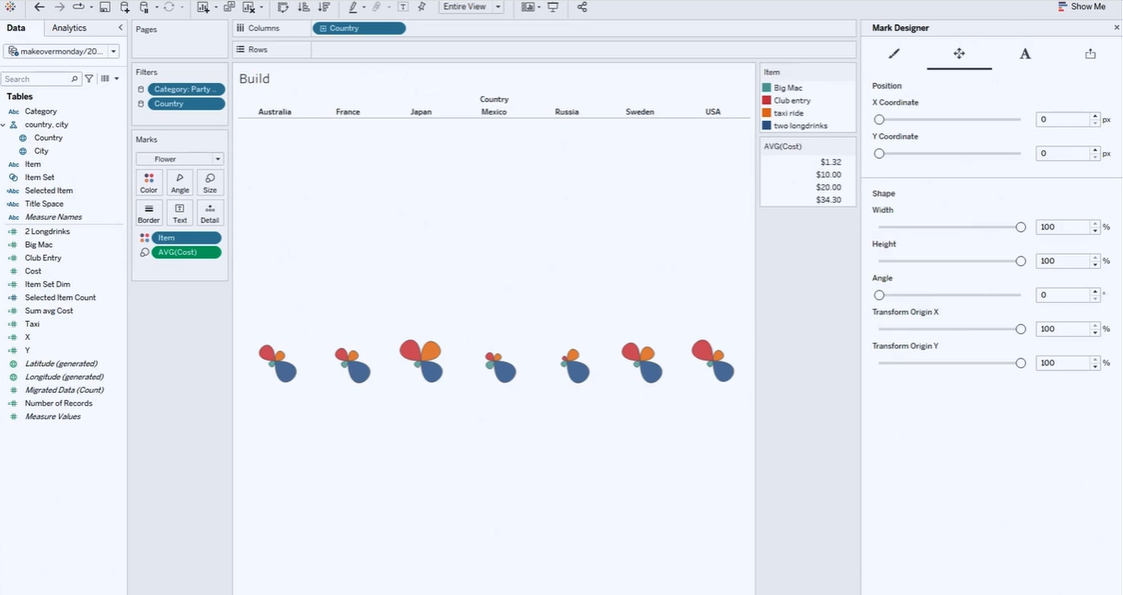
Think of Tableau’s future and the art of the possible; those visions shine with each year’s Devs on Stage presentation. This year was no different! Some of the highlights include:
Drag and drop extensions with custom marks type and marks designer – This feature will be a fantastic help to those that want a more flexible solution to creating bespoke visualizations.
Dynamic layouts utilize parameterized show/hide containers - Although show/hide containers have existed, using dynamic show/hide containers offers more design flexibility.
Total control of ‘View Data’ - A user will access data but also have total control of the data they wish to export – in future iterations, this will be publishable as a dashboard so other users can see what you discovered and explicitly desired to share.
Workbook Optimizer - Salesforce has a dashboard optimizer and impressive performance checking; this will be no different with an experience geared toward workbook reviews applying plain language results to identify quickly and correct issues impacting the end-user experience.
Data Change Radar – This will monitor dashboards to see whether there are meaningful data changes. It utilizes the enhancements in ‘explain data’ to highlight those impactful changes quickly. This is different from subscription alerts as it will be a visible icon on the dashboard.
Data Policy and virtual connections in Tableau Prep - Data managing in prep will be far more efficient and easier to update multiple tables and mapping from one spot rather than from many. Security can modify via data policy with a preview. Even more, the notification of flows can be added to Slack. Finally, linked tasks can manage flows with error handling and quick changes which has the feel of Salesforce’s data approach).
Server enhancements to easier handle server resources - A server administrator will be able set limits on refreshes, subscriptions, Prep Builder Flows, and Backgrounder hours on a site level. In addition, there will be auto-scaling for backgrounders to help manage peak and off-peak performance.
3. Inclusive Design: Making Dashboards Engaging, Informative, and Accessible (Emily Kund)
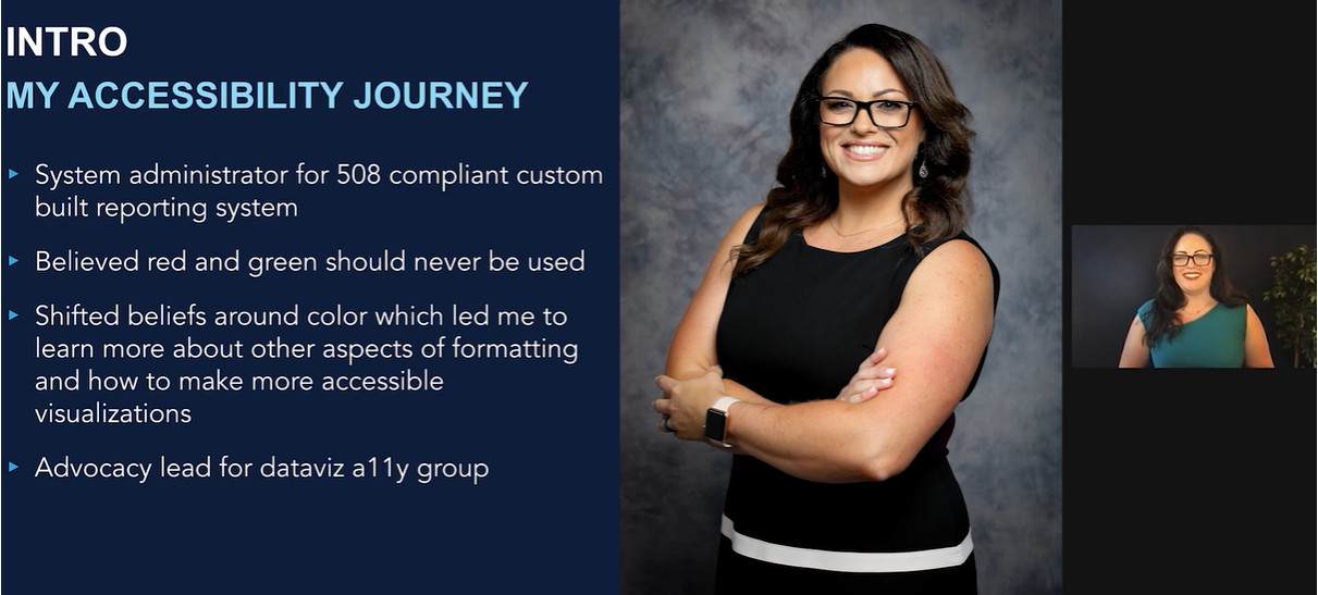
Inclusive design is essential to making dashboards more user-friendly, engaging the audience, and ensuring that the most people possible can utilize work. Emily Kund’s presentation on the topic is the best one I’ve seen and should be required viewing for data consumers and designers.
4. Minimalist Designs for Maximum Communication (Chimdi Nwosu)
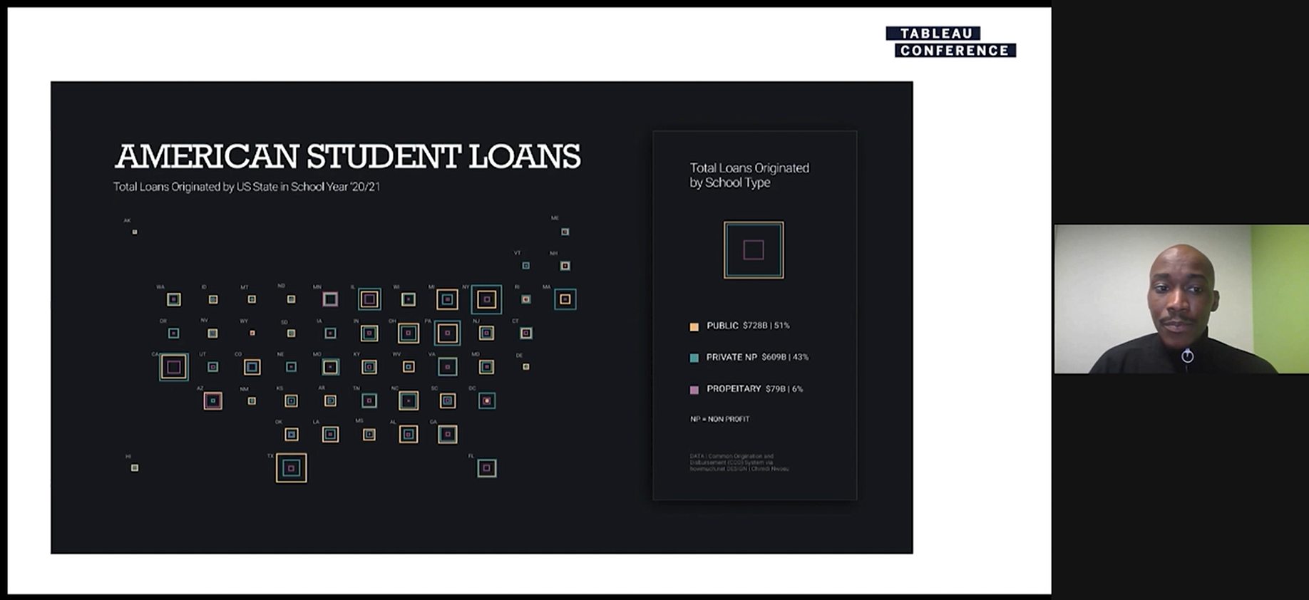
Chimdi has burst onto the Tableau scene in the last year creating some of the most engaging business and personal project dashboards the community has seen. In fact, he won 4 Tableau Conference ‘Vizzie’ Awards for his efforts (most since Kevin Flerlage in 2019). Check out his compelling presentation of his dashboard for advice and tips on optimizing design.
5. Iron Viz (left to right: Pradeep Kumar G., Lisa Trescott, and Samuel Parsons)

Iron Viz is the ultimate Tableau demo masquerading as a competition with competitors spanning the globe. I had the privilege of judging Iron Viz qualifying entries this year and the finalists were a representation of the best entrants. This competition was brilliant and, like in past years, each competitor had their strong suits and a prize-worthy entry. I won’t spoil it for you, so please watch the episode yourself!
6. Zen Masters Share Their Best Advice Part 1 and Part 2 (Tableau Zen Master and Hall of Fame Zen Masters)
Nothing is more valuable to Tableau learners than getting advice from the best of the best. This session covers everything from tips, to design, to the countless ways you can skill up.
7. Find Your Voice: How Community Builds Confidence (Priya Padham)
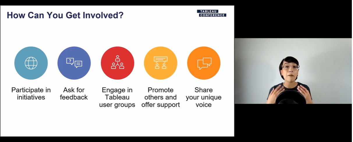
It is no secret that utilizing community resources and knowing how to navigate them speeds up your learning curve as a data visualizer. Priya gave an overview of available resources and highlighted our global community to help you understand and find these resources.
8. Make It Better: Tips for Better Dashboard Design (Ken and Kevin Flerlage)
The two Zen Masters and community stalwarts who are the 2nd and 3rd most followed of all-time on Tableau Public provide a zensational introduction to techniques and tricks to enhance your dashboards. These tips are not intuitive but are simple to apply, so this presentation is perfect for any skill level.
9. Data + Diversity: How Tableau Is Building an Inclusive Community (Candra McRae, Siroros Roongsdansai, Sedale McCall, Joshua Smith, and Andrew Grinaker)

In recent years, Tableau has focused extensively on inclusion and made significant strides supporting a more diverse community, including people of different racial/ethnic backgrounds, non-English speakers, and neurodiverse people. There is still progress to be made and complex conversations to be had, and the Tableau Community Equity Task Force tackles these topics in this session.
10. Tableau Speed Tips: Shortcuts and Tricks for All Skill Levels (Ann Jackson, Lorna Brown, and Heidi Kalbe)
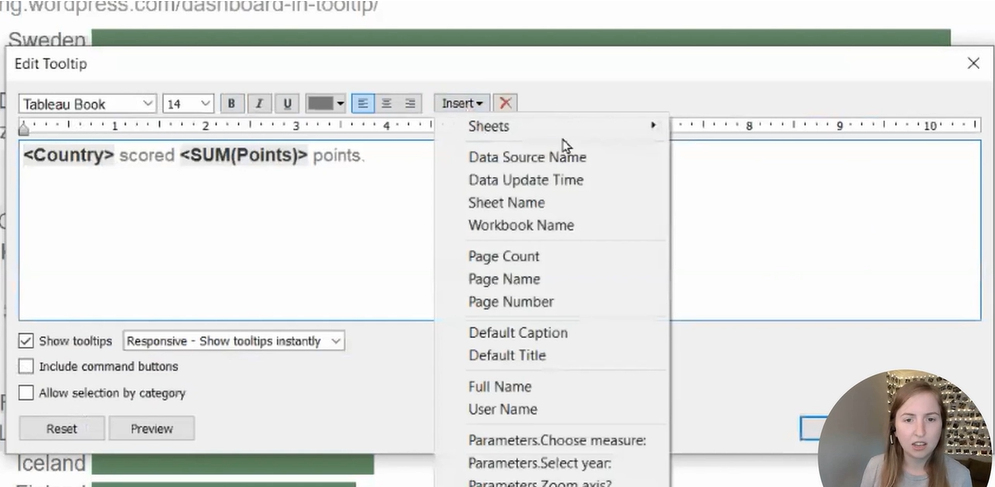
Speed tips have long been a Tableau Conference favorite. Heidi, Lorna, and Ann provide exciting tips that users of all skill levels can benefit from. This jam-packed session feels a bit like a roller coaster because there are so many valuable tips to crammed into just ~25 minutes (the session really lives up to its name!).
