Flexible data structures such as key-value pairs or more specifically entity-attribute-value (EAV), are a popular choice for many business applications. They allow for efficient storage (often in JSON format) in cases where the number of possible attributes for an entity is very large, but any given record only has data for a handful of them.
Unfortunately, this storage type is great for getting data in but difficult for getting data back out, which is what analytical tools such as Tableau are all about.
We recently encountered this with one of our customers where some of the more common strategies to deal with this type of data storage didn’t cut it – here is how we solved it.
The Problem
In our scenario we want to build a dashboard around a patient’s diagnosis data. A patient (i.e. “the entity”) may go through different medical tests (i.e. “the attributes”) than another patient, but we want to allow physicians to be able to quickly switch between patient 1 and patient 2 (and all other possible patients) without having to recreate a dedicated dashboard or visual per patient. Remember – the combination of medical tests per patient varies and so we don’t have a consistent structure that we can reuse across all patients.
To make things more complex, the flexibility of this data structure allows for easy addition of new attributes on the storage system side, meaning that the visual analytics layer will need to respond dynamically to the new inputs.
Our Approach
When looking at a repetitive reporting solution (i.e. a dashboard that refreshes every day), most analytical tools work best with a pre-defined data structure with a fixed number of columns, ideally flattened as much as possible. Some databases such as PostgreSQL or Snowflake support SQL dialects that allow you to flatten JSON key-value pairs using a SQL query, but since the output of those queries may change every time the query is executed, it is challenging to leverage those queries directly in the analytical tool. Alternatively, pre-defining flattened structures in your data warehouse would work best for your analytical tool’s repetitive needs but could be difficult to develop and maintain on both the database end and the analytical tool end. Other options to flatten the JSON data include using Python within Tableau Prep like we used here, but again the data structure may change meaning our scheduled dashboard update may break.
Flattening your data would be ideal, but it’s often not an option.
We needed to find a way to receive a fixed data structure but dynamically visualize a different structure for each entity (that is a patient in our case).
Enter Tableau Extensions. If you’ve heard of Tableau’s extensions, you can skip to the next paragraph, otherwise you should know that Tableau dashboard extensions are self-deployed web applications that have two-way communication with the dashboard. Dashboard extensions enable all sorts of scenarios such as integrating Tableau with custom applications, modifying the data for a visual or even creating custom visualizations using a third-party JavaScript library and placing it inside the dashboard. The possibilities are endless.
For our scenario, we built a Tableau extension to read, parse, and then display the semi-structured data dynamically.
Understanding the Solution
Our solution will work with any number of patients with many numbers of possible attributes, however, for simplicity, we will be using 2 patients with limited number of attributes per patient.
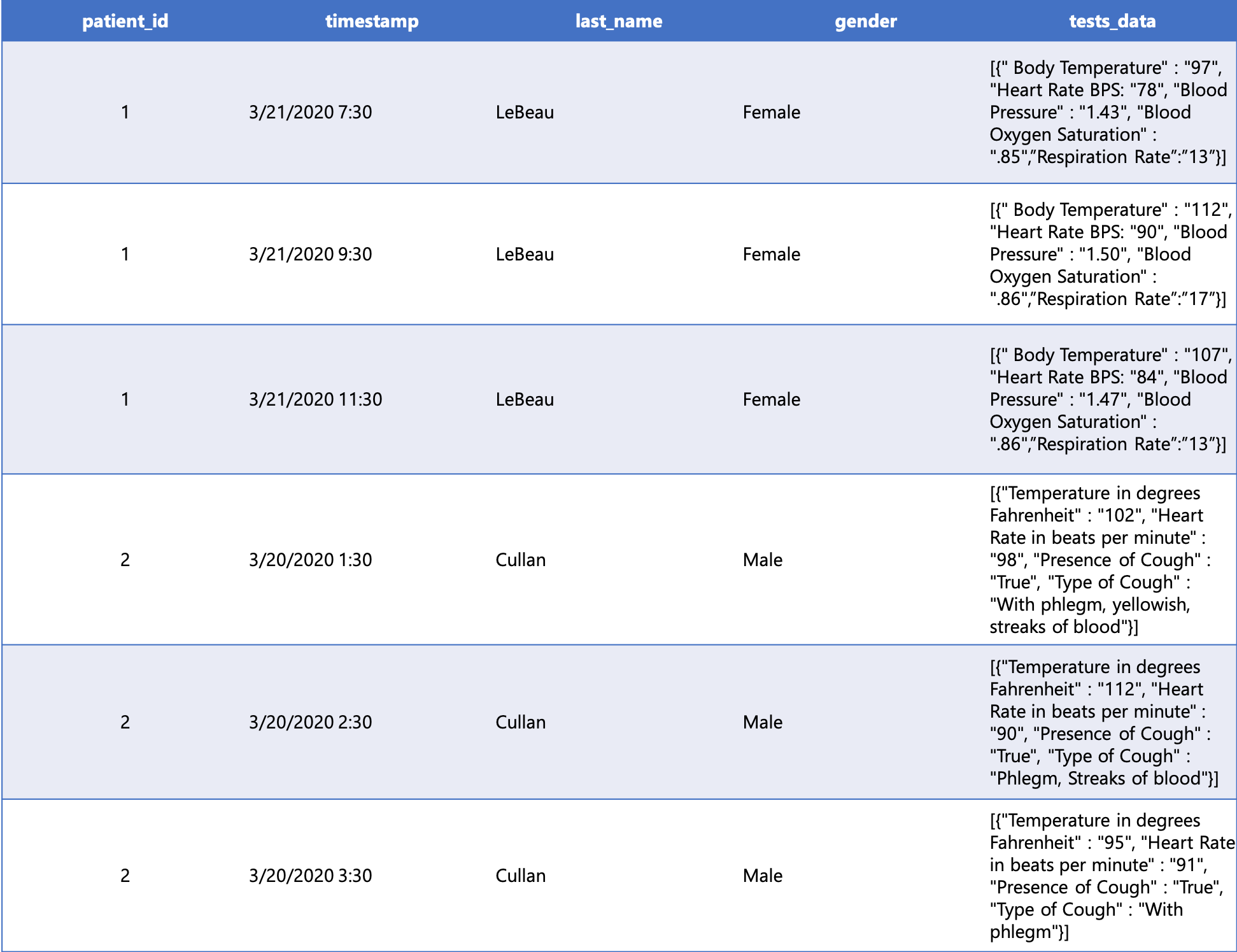
Here is a sample of the dataset - note the timestamp varies for each patient row and the data attributes varies per patient.

Step 1: Build the dashboard
Connect to your data as you normally would and bring in the JSON data column as is.
Build the dashboard, providing real estate for the extension
Step 2: Build the extension
For our scenario we leveraged the following React sample from Tableau that proved to be a good starting point.
Modify the extension to be able to parse the JSON attributes field
This can be done in a number of ways, but for simplicity we used the JSON parse function to parse the array, then we looped through the parsed JSON object to add the key-value pairs to the headers and rows field we will be visualizing below.
Add a visualization type to display the parsed data. In our case, we added a table visualization that displays the parsed data
The sample noted above uses the datatables library, which also works well in our case.
Enable interactions and filters
We implemented event listeners to see if a user made changes to the dashboard filters or selected any marks on a visual or the underlying table.
Step 3: Add the extension to the dashboard
Follow these steps
Adding the extension to the dashboard
The Result
Voila! We have dynamic table visualizations that update based on the selected patient. In the following video you can see how the bottom table columns change based on the filter selection or the selected row within the top table:
With this type of extension, any dashboard creator (even those who are unfamiliar with JSON) can create a dynamic dashboard that displays semi-structured data in a user-friendly fashion.
No time to dive into extensions? If you would rather avoid developing the extensions and creating the dynamic interactions between the Tableau visuals, we can help by developing a solution in your environment. After a brief chat, Keyrus can immediately start processing your data, developing your customised extension, and even design and build your new dashboards.
