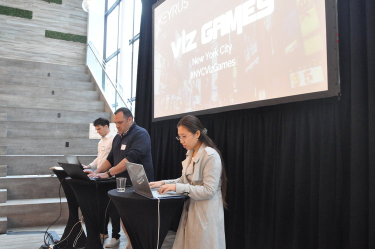
Last week three Tableau pros took the stage for the first ever New York City Tableau Viz Games.
We spent the previous months searching far and wide for data viz experts who would be worthy of the challenge. Similar to Iron Viz, the competitors would have 20 minutes onstage to build data dashboards for a live audience.
Competitors would receive the dataset ahead of time to prepare, and their dashboards would be judged by a panel based on storytelling, design, and analysis. The competitors could use up to one additional data source to enrich their dashboards. They were also required to use Tableau Prep to make data modifications or to join in other data sources during the event.
As the inaugural Viz Games event in NYC, we knew we had to pick a New York City dataset. We all love to eat, and most New Yorkers have wondered about the letter grades that are displayed in the windows of every restaurant in the city, so New York City Restaurant Inspection Results seemed like the perfect choice. We gave our competitors one month to prep something tasty for us.
Our emcees, Ashley Lorello and Sam Strong, were dressed to the nines and ready to see who would be the winner of the coveted $1,000 check.

Our competitors took to the stage early to prepare and put on their game faces.

Ashley and Sam kicked things off and we set the clock for 20 minutes.

Our first contender, Minyeong Han, is a grad student pursuing a Master of Science in Data Analytics and Visualization. As the only competitor to bring in an additional data source, Minyeong combined the health inspection data with Yelp reviews. She wowed us with custom rat and cockroach shapes.
Check out her dashboard on Tableau Public.
Contender number two, Mike Daddona, is the Director of Custom Reporting at The NPD Group and has been working with Tableau for four years. He set out to create a dashboard that makes it easier to decide which restaurant to eat at, and he definitely delivered. The user can choose a borough, cuisine type, and restaurant scores and violations.
Check out Mike's full dashboard.
Our final contender, Jacob Olsufka, works at Spotify as a Data Visualization Engineer. He was also a Tableau Iron Viz finalist in 2017, so we knew he would be prepared to bring the heat. Jacob’s dashboard shows the best and worst cuisines based on health inspection results and also breaks them down by borough. He then dives deeper into scoring inspections and violation types. The audience was collectively disturbed by the number of violations for mice.
Check out Jacob's full dashboard on Tableau Public.
After our competitors presented their dashboards, our judges had an opportunity to ask questions. On this year’s panel of judges, we had Taylor McGrath, Managing Consultant at Keyrus; Roman Usatin, Sales Consultant at Tableau; and Christine Testa, President of Early Warning Food Service Solutions and NYC food inspection instructor. While the judges deliberated, we let the audience vote before tallying the final results.
And our 2019 NYC Viz Games Champion is…
Jacob Olsufka! Jacob’s dashboard came in first in both the judge and audience votes, followed by Mike in second and Minyeong in third.

A big thank you to all three of our competitors and our judges, and congratulations to Jacob!