𝗧𝗼𝗼 𝗼𝗳𝘁𝗲𝗻, 𝗱𝗮𝘀𝗵𝗯𝗼𝗮𝗿𝗱𝘀 𝗳𝗮𝗶𝗹 Power BI dashboards can be one of the potent tools in business – providing convenient and relevant insight for effective strategic planning and decision-making. So, it’s surprising how many organisations fail to develop their dashboards in the right way. Indeed, dashboards are often criticised for a number of different reasons, some of which you’ve probably experienced. They may be slow to function and update; contain incorrect or excessive amounts of data; appear too complex or detailed; be poorly designed or cluttered in appearance… and so on.
𝗪𝗵𝘆 𝗱𝗼 𝘁𝗵𝗲𝘆 𝗲𝗻𝗱 𝘂𝗽 𝘁𝗵𝗶𝘀 𝘄𝗮𝘆?
One common reason is that, when an urgent requirement or demand comes along, it’s easy to jump straight to building a dashboard only with that objective in mind, instead of stopping to consider its broader purpose or the considerations for its users and long-term future.
As such, the end result is somewhat confusing and convoluted. Initially, it fulfills its immediate need but then as more people demand more things going forward, it grows in a reactive and disorganised way, trying to be all things to all people with no real focus on the value it needs to add. Ultimately, it becomes unwieldy and unmanageable.
How can you prevent this from happening?
Four steps to a successful dashboard
Successful and effective dashboards always consider four key best practices:
Plan
Design
Test
Repeat
Each stage informs the next, and the process is cyclical. Let’s take a closer look at each one in turn.
Success lies in planning
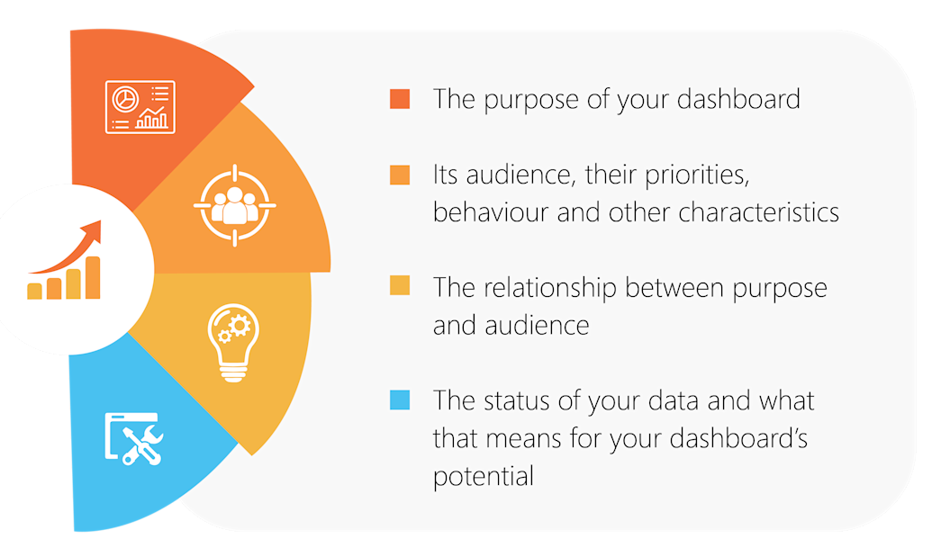
Before opening the Power BI tool, you should take the proper time to understand and establish the following:

Identify the purpose
First, consider what your dashboard actually needs to deliver. Why are you building it? What should it include? What business goal is it looking to achieve?
Keep your answers clear and concise. For example, it could measure the performance of your sales department employees, to increase sales in a specific country or region. This objective can then be underpinned by related criteria, such as measuring your sales conversion rate in the particular country over time or recording who your highest-performing sales manager is every month.
With multiple stakeholders to satisfy and different demands to address, it’s worth organising a workshop or brainstorming session so that all stakeholders can feel included and able to have their say. Ask open questions and ensure you capture everyone’s priorities in one place, before agreeing how to proceed. And remember to ask ‘why?’ when someone shares a specific dashboard request or objective.
Once completed, confirm and document the criteria, along with the metrics and (or) KPI's you will use to monitor progress.
Know your audience
Who is going to use your dashboard? Which department do they work in, and what information and insights will be most important for them? What is their incentive to interact with dashboard data, how will they consume it, and what will its success look like for them?
Your audience members will typically fall into one of four core categories, in terms of their dashboard demands:
Analytical: they will leverage data to support employees across the business. So, it needs to be fast and easy to understand and report on.
Strategic: they will track KPIs over time to gain strategic insights and observe trends. In this way, critical success factors can be predicted and evaluated for leadership teams.
Operational: they will provide an overview of business performance on the ground, to identify successes as well as issues requiring immediate action and areas for improvement.
Tactical: they will value insights relating to specific data points during a focused time period, such as month-to-month changes, and drill right down into the data for deeper investigation.
Download the full whitepaper to learn about all 4 steps critical to designing effective BI dashboards. Should you need further assistance with any of your BI challenges, contact us at sales@keyrus.co.za.
